
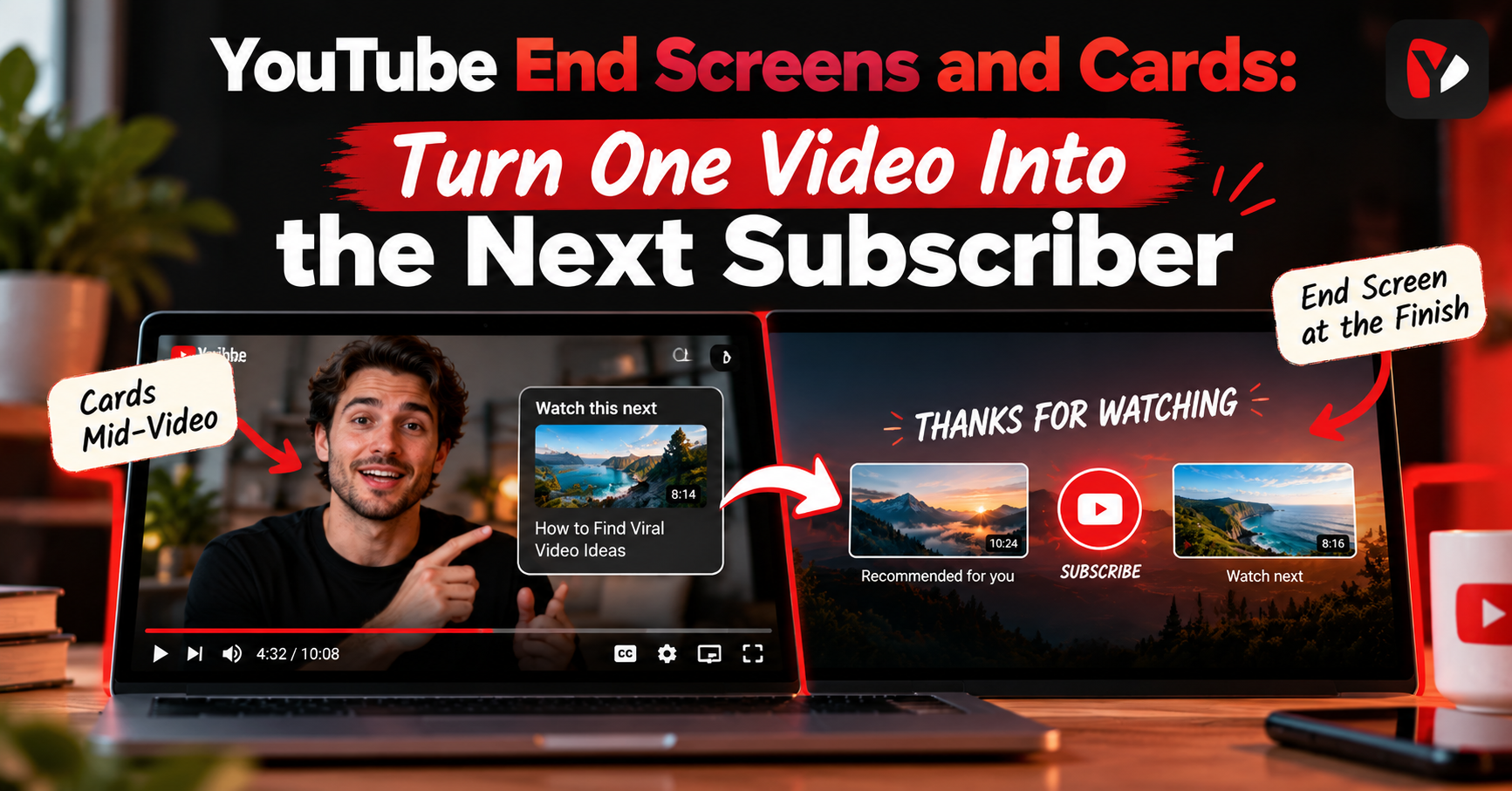
YouTube End Screens and Cards: Turn One Video Into the Next Subscriber
YouTube end screens are clickable elements that appear during the last 5 to 20 seconds of a video, offering the next video, a playlist, or a subscribe button. Cards are small teasers that appear at any chosen moment during playback. End screens close a video; cards support it mid-watch.
Most creators end a video by saying "thanks for watching" over a blank screen. That moment is the single most valuable piece of real estate on the whole upload — the viewer has just finished something they liked, which is the exact instant they are most willing to watch another one.
That is what YouTube end screens are for. Together with cards, they are the built-in tools for turning one watched video into a second watch, a subscription, or a click. They take about two minutes per upload and most channels either skip them or use them badly.
What's the Difference Between YouTube End Screens and Cards?
End screens appear only at the end; cards can appear at any point during the video. That is the core distinction, and it drives everything else about how you use them.
| End screens | Cards | |
|---|---|---|
| When they appear | The last 5 to 20 seconds of the video | Any moment you choose during playback |
| How they look | Large clickable tiles laid over the video | A small teaser, then a panel when opened |
| How many | Up to 4 elements on a standard 16:9 video | Up to 5 per video |
| Subscribe button | Yes — this is the only place it exists | No |
| Requirements | Video at least 25 seconds long; not available on Made for Kids videos | Available to any channel for video, playlist and channel cards; link cards require Partner Program membership |
One practical consequence: because the subscribe element lives only on end screens, a video without an end screen has no in-video way to ask for a subscription at the moment the viewer is most inclined to give one.
How Long Should a YouTube End Screen Be?
Somewhere between 5 and 20 seconds — that is the window YouTube allows, and the video itself must run at least 25 seconds to have one at all. Within that window, longer generally beats shorter.
A 5-second end screen is only seen by viewers who stayed to the final moment. Set it to 15 or 20 seconds and it appears while more people are still watching, which is the whole point. The trade-off is that you need content underneath it — an end screen over dead air feels like the video already finished, and viewers leave.
The editing habit that makes this work: keep talking during the end screen. Deliver your actual final thought — a summary, a last tip, a reason the next video is worth watching — while the elements are on screen. Viewers stay for the audio, and the elements get seen instead of skipped.
End Screen Layouts That Work
Four elements are the ceiling, not the target. Two is usually better than four, because every extra tile splits the decision. Three layouts cover most situations:
Subscribe plus one video
The default for most channels. One subscribe element and one specific video — chosen deliberately, not left on "most recent upload." Pick the video that best serves someone who just watched this one, and say out loud which video it is and why.
The playlist funnel
One playlist element instead of a single video, used when your content runs in a series. A playlist keeps playing automatically after the next video ends, so a viewer who clicks it can keep going without deciding again. Best for tutorials, courses, and any multi-part format.
Subscribe plus best-for-viewer video
Instead of promoting your newest upload, promote the video most likely to hold this particular viewer. If your topic has an obvious next question, the video answering it belongs here. This tends to serve viewers better than recency does, and it is the layout most creators never try.
When to Use Cards Mid-Video
Cards work best as a reference, not an interruption. The natural moment is when you mention something you have covered elsewhere: "I explained the full setup in another video" — card appears, viewer notes it, video continues.
- Place them where the reference happens, not at a random interval. A card that appears with no verbal cue is usually ignored.
- Do not put cards in the final 20 seconds. Card teasers are suppressed while an end screen is showing, so a card there loses the teaser that makes it noticeable.
- Use fewer than you are allowed. Five cards is the ceiling; one or two well-placed ones outperform a video peppered with them, because each one is a small invitation to leave.
Do End Screens Increase Watch Time?
They can increase session watch time — the total a viewer spends on YouTube after arriving at your video — by making the next watch a single click instead of a decision. What they cannot do is improve the retention of the video they appear on. Nothing about an end screen makes people watch the current video longer.
It is worth being clear about what is not knowable here: no one outside YouTube can quantify the effect on recommendations. What you can measure is your own end-screen click-through rate, which is reported in your analytics. Treat that number as the honest scoreboard rather than any general claim about watch time. For the broader picture of what drives views, see How to Get More Views on YouTube.
Can You Add End Screens to Shorts?
No. End screens are a long-form feature, and Shorts do not use them — the format has no end-screen window, and the video-length requirement alone rules out most Shorts. Cards are likewise not part of the Shorts experience.
For Shorts, the equivalent job is done differently: through your pinned comment, your channel branding, and whether the Short makes someone curious enough to tap through to your channel. Do not design a Shorts strategy around end screens; design it around what makes a viewer look for more.
How to Add an End Screen in YouTube Studio
The setup takes about two minutes per video once you know where it lives.
1. Open YouTube Studio and select Content, then click the video you want to edit.
2. Open the editor and choose End screen. If the option is unavailable, check the video is at least 25 seconds long and is not set as Made for Kids.
3. Add your elements. Pick a specific video rather than leaving it on an automatic option, and add the subscribe element if you want one.
4. Position them where your outro has space. Drag the tiles into the gaps you left in the edit, not over your own text.
5. Set the timing on the timeline below, then save. Starting the elements earlier in the allowed window means more viewers see them.
One shortcut worth knowing: the editor lets you import an end screen from a previous video, which copies the layout and timing so you only need to change which video is promoted. If you use the same layout every time, this turns a two-minute job into a twenty-second one.
Common End Screen Mistakes
- Four elements when two would do. Every additional tile splits attention. If you are using all four, you are probably converting fewer viewers than you would with two.
- A subscribe button with no direction. A subscribe element on its own gives a viewer nowhere to go. Pair it with a video so there is a next step for people who are not ready to subscribe.
- Linking unrelated content. Promoting your newest upload regardless of topic sends a viewer somewhere they did not want to go. Relevance beats recency every time.
- No room in the edit. If your outro fills the frame with text and animation, the end screen elements land on top of it and everything becomes unreadable. Design the outro with empty space where the tiles go.
- Silence under the end screen. The most common one. If the audio stops, viewers leave — and the elements never get seen.
Make Them Look Like Your Channel
End screen elements pull in each video's thumbnail, which means your end screen looks exactly as consistent as your thumbnails do. If your thumbnails share a colour, a font, and a layout, the end screen reads as one coherent shelf of your work. If they do not, it reads as a jumble.
This is a good argument for building thumbnails from a repeatable template rather than designing each one from nothing — the Thumbnail Maker is one way to keep that consistency across uploads. The same applies to your outro frame: a plain background with space where the tiles sit will always outperform a busy one.
Check What Is Actually Getting Clicked
End screens are easy to set once and never review. That is a mistake, because the right video to promote changes as your library grows — the video that made sense as a follow-up a year ago may not be your best one now.
Your end-screen click-through rate is reported alongside your other channel metrics, and it tells you plainly whether the element is doing anything. Check it in Channel Analytics every month or so, and when a promoted video stops earning clicks, swap it. That single habit is what separates end screens that work from end screens that merely exist.
The Bottom Line
End screens and cards are the cheapest optimisation on YouTube: two minutes per upload, using space you have already paid for. Keep the end screen to two elements, run it for 15 to 20 seconds with your voice still going, promote the video that genuinely serves the viewer who just finished, and use cards sparingly at the moment you actually reference something.
Then check which end screen elements are actually getting clicked in Channel Analytics, and change the ones that are not. It works from a phone as well as the web.