
YouTube Retention Benchmarks: What Percentage Is Normal at 30 Seconds, 1 Minute, and 50%?
If your retention graph falls off a cliff in the first 30 seconds, here's the first thing to know: that cliff exists on almost every video on YouTube. Searching for YouTube retention benchmarks usually returns a single percentage with no context - so let's start with the two honest facts most articles skip. One: YouTube publishes no official retention benchmarks; every number you've seen is derived from creator data, including the directional ranges below. Two: retention percentages cannot be compared across video lengths - a "worse" percentage on a longer video is routinely the stronger performance.
This guide gives you the checkpoint numbers creators actually search for - what's normal at 30 seconds, 1 minute, and the halfway mark - plus average-percentage-viewed norms by video length, every figure labeled with its source. Then the part that matters more than any number: how to read your retention graph like an analyst, with the five named drop-off patterns and the one question that decides what to fix.
Quick Answer
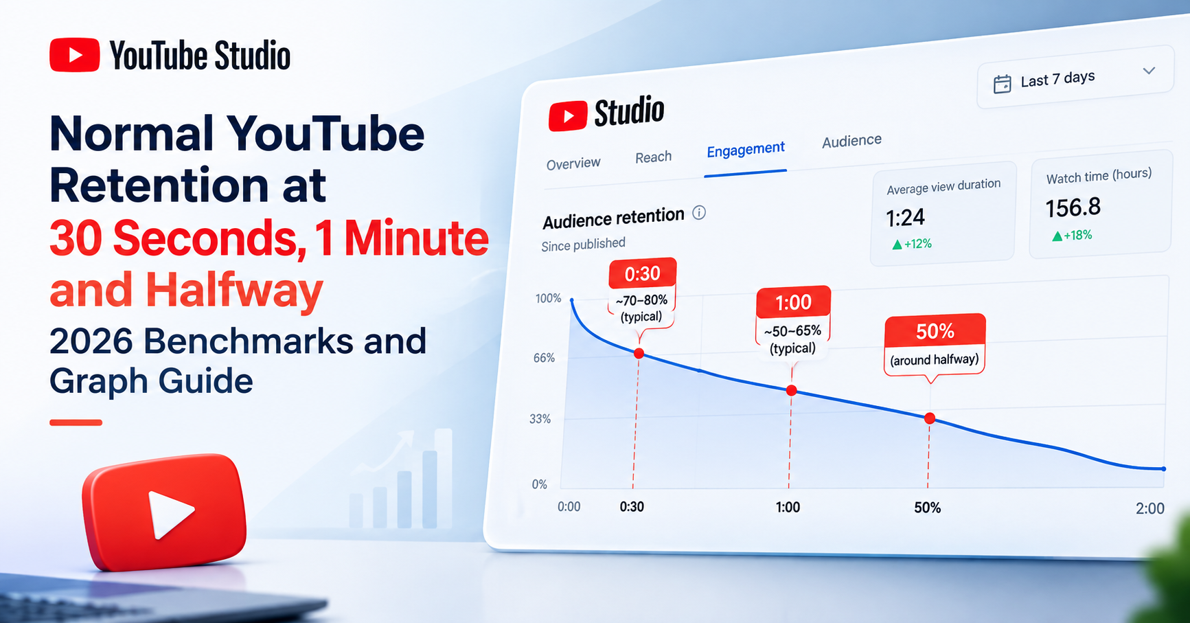
YouTube publishes no official retention benchmarks, but across creator data, keeping 60-80% of viewers at 30 seconds, 50-70% at 1 minute, and 35-55% at the halfway mark is typical. "Good" depends heavily on video length - always compare average percentage viewed within the same length band, or use YouTube's relative retention.
Retention Metrics, Defined
Four terms, precisely - because half of retention confusion is vocabulary:
- Audience retention - the percentage of viewers still watching at each moment of a video, shown as a curve in YouTube Studio.
- Average percentage viewed (APV) - the average share of the video watched across all views.
- Average view duration (AVD) - the average watch time in minutes and seconds.
- Absolute vs relative retention - absolute is your video's own curve; relative compares your curve against all YouTube videos of similar length. Relative retention is the only place YouTube itself gives you a length-normalized comparison - learn to use it.
And the chain that makes retention matter: AVD × views = total watch time - and total watch time is what actually accumulates in your favor with recommendations. Every percentage in this article is ultimately in service of that multiplication.
What Percentage Is Normal at 30 Seconds, 1 Minute, and the Halfway Mark?
The checkpoint YouTube itself instruments: YouTube Studio's own "Intro" card reports the percentage of viewers who continue past the first 30 seconds - the platform's own analytics treat 0:30 as the decisive moment. The ranges below are directional figures from public creator-data analyses published in 2026:
| Checkpoint | Typical healthy range | Warning sign | Source tier |
|---|---|---|---|
| 0:30 (the "Intro" card) | ~60–80% still watching (above ~80% is strong) | Losing over ~50% by 0:30 usually signals a packaging mismatch | Public creator-data analyses, 2026 (directional); checkpoint itself is YouTube's own Intro metric |
| 1:00 | ~50–70% still watching (5–15 min videos) | Below ~40% at 1:00 points to intro or premise problems, not mid-video pacing | Public creator-data analyses, 2026 (directional) |
| 50% mark of the video | ~35–55% still watching (mid-length videos) | If ~half your starting audience reaches halfway, the video is holding attention normally | Public creator-data analyses, 2026 (directional) |
Directional ranges from public creator-data analyses - YouTube publishes no official benchmarks. Benchmark against your own channel history and YouTube's relative-retention view, not this table.
The reassurance first: losing a fifth to a third of viewers in the first 30 seconds is normal, not failure - a portion of every audience clicked out of curiosity and was never going to stay. What the checkpoints diagnose is the shape of the loss: a moderate intro dip is the platform working; losing more than half your audience by 0:30 is a signal worth acting on, and the packaging-vs-content section below tells you which fix it points to.
Why You Can't Compare Retention Percentages Across Video Lengths
This is the rule most retention articles miss entirely: retention percentage is inversely related to video length. Holding a viewer for 60% of 3 minutes is a much smaller ask than holding them for 40% of 20 minutes. Comparing raw percentages across different lengths is the retention equivalent of comparing CTR across traffic sources - the numbers live on different scales. Typical average-percentage-viewed bands by length:
| Video length | Typical APV | What that means in minutes | Source tier |
|---|---|---|---|
| Under 3 minutes | ~60–75% | ~1.8–2.2 min AVD on a 3-min video | Public creator-data analyses, 2026 (directional) |
| 3–5 minutes | ~55–65% | ~2–3 min AVD | Public creator-data analyses, 2026 (directional) |
| 5–10 minutes | ~45–55% | ~3–5 min AVD | Public creator-data analyses, 2026 (directional) |
| 10–20 minutes | ~35–50% | ~4–8 min AVD | Public creator-data analyses, 2026 (directional) |
| 20+ minutes | ~30–40% - and can be excellent | ~6–10+ min AVD - often the biggest watch-time videos on a channel | Public creator-data analyses, 2026 (directional) |
Directional ranges from public creator-data analyses - no official benchmarks exist. Compare within the same length band, or use YouTube's relative retention, which normalizes for length automatically.
The minutes-translation corollary: 40% APV on a 20-minute video equals 8 minutes of average view duration. 60% APV on a 3-minute video equals 1.8 minutes. The "worse" percentage delivers roughly four times the watch time per viewer - and watch time, not the percentage, is what accumulates with the algorithm. Translate percentages into minutes before judging anything.
How Channel Size Changes What's Normal
Smaller channels typically post higher retention percentages - their views come disproportionately from warm subscribers and niche-matched viewers who chose the channel deliberately. As a channel grows and impressions broaden to colder audiences, retention typically compresses: more viewers arrive with weaker intent, sample the video, and leave earlier. If that mechanic sounds familiar, it should - it's exactly how CTR behaves as impressions scale, and we've covered that half of the story in what is a good CTR on YouTube. Same rule in both metrics: a "declining" number on a broadening audience is often growth, not decay - judge against your own history at comparable audience temperature.
How to Read Your Retention Graph in YouTube Studio
Find it under YouTube Studio → Analytics → select a video → Engagement (the audience-retention card). The single average hides everything useful; the curve's shape is the diagnosis. Five named patterns cover nearly every graph you'll see - what each looks like, what it means, and what to do:
The intro cliff (steep loss from 0:00 to 0:30)
Usually a promise mismatch: the thumbnail and title sold a different video, or the intro delays the payoff with logos, long greetings, and throat-clearing. The fix is to open on the promised thing - cold-open into the content before any branding, and confirm within seconds that the viewer is in the right place.
The steady, gentle slope
A gradual decline with no sharp features is normal and healthy. Every video sheds viewers continuously - people finish getting what they needed, get interrupted, or move on. This is the shape of a well-paced video. Don't fix it; make more of it.
Mid-video dips that recover
A valley followed by a plateau marks a skippable segment - a tangent, a sponsor-style aside, or a repeated explanation viewers jumped past. The video survives it, but you're paying a toll. Tighten the segment, relocate it later, or cut it.
Mid-video cliffs that don't recover
A step down that never comes back marks the moment the video's promise was fulfilled or broken - viewers either got what they came for and left, or gave up waiting for it. The fix is structural: restructure the payoff timing, and seed the next open loop before closing the current one so there's always a reason to keep watching.
Spikes and bumps above the trend
Moments viewers rewatched or shared to a timestamp - the most valuable diagnostic on the whole graph. Study what made those seconds work, make more of it, mark spike moments as chapters, and treat each one as a candidate topic for its own future video.
The end-screen cliff
A sharp fall in the final 10-20 seconds is normal - viewers leave when the content visibly wraps up. Mitigate it by keeping outros short and pointing to the next video before the wrap-up begins, so the leaving happens into your next video instead of away from your channel.
Is It a Packaging Problem or a Content Problem?
The decision rule: an intro cliff followed by a healthy slope is usually a PACKAGING problem - the wrong viewers arrived, so fix the title and thumbnail targeting, not the video. A good intro hold followed by mid-video decay is a CONTENT problem - the right viewers arrived and the video lost them, so fix pacing, structure, and payoff timing. Diagnose which one you have before changing anything.
This distinction is also where retention and CTR meet. Packaging fixes move both metrics together: a title-thumbnail pair that promises the actual video attracts viewers who click AND stay. That's why CTR × watch time is the pair the algorithm rewards - a high CTR that collapses into an intro cliff reads as clickbait, while a moderate CTR that holds reads as satisfaction. The two benchmark posts in this pair are really one system: earn the right click, then keep the promise. And when the diagnosis is topic-audience mismatch rather than packaging at all, better topic selection is the actual fix - see find trending YouTube video ideas.
Why Retention Matters to Recommendations
Briefly and honestly: YouTube's recommendations optimize for viewer satisfaction, and watch time with retention are central inputs to that. The quantity being accumulated is total watch time - AVD × views - which is why the minutes-translation above matters more than any percentage. What nobody outside YouTube knows is the exact weighting of these signals, and this article won't pretend to. The practical version is simple enough: videos that hold viewers get recommended more, and the retention curve tells you where yours stops holding.
What About Shorts Retention?
Shorts play by different math. The swipe feed replaces the click decision, retention is measured against very short durations, and looping means a Short can post retention above 100% when viewers rewatch. Long-form benchmarks simply don't apply - don't judge a 30-second Short against the tables above. The full Shorts treatment lives in why your Shorts get no views.
How to Diagnose Your Retention Faster
YouTube Studio shows you the curve - but it explains very little. You're left to interpret the shape yourself, which is exactly the skill this article just taught. If you want that interpretation done with you, this is where our tool fits - disclosure: YouSEO publishes this blog. YouSEO is an AI-powered YouTube growth toolkit that helps creators plan, create, optimize, analyze, and grow a YouTube channel - all in one app, for creators at every milestone. Our YouTube video SEO checker (Video SEO Analysis) includes retention guidance in plain language as part of its weighted scoring - flagging the likely pattern type and whether the fix points packaging-side or content-side. We treat the retention insight as the highest-value part of the analysis, because it is: metadata is quick to fix, but retention is where videos are won. Use it as a pre-flight check before publishing and a post-mortem after - a companion to Studio, not a replacement, and not a promise of results. It pairs naturally with a full check of your video's SEO score before you publish.
Frequently Asked Questions
What is a good retention rate on YouTube?
There's no official number - YouTube publishes no retention benchmarks. Directionally, 45-55% average percentage viewed is typical for 5-10 minute videos, with higher percentages normal on shorter videos and lower on longer ones. Judge within your video's length band, against your own history, and with YouTube's relative-retention view.
Is 40% average percentage viewed good?
It depends entirely on length. On a 20-minute video, 40% APV means 8 minutes of average view duration - strong performance and serious watch time. On a 3-minute video, 40% is 1.2 minutes and below typical ranges. Translate the percentage into minutes before judging it.
What's normal retention at 30 seconds?
Keeping roughly 60-80% of viewers at the 30-second mark is a typical healthy range across creator data, and above 80% is strong. Losing a fifth to a third of viewers by 0:30 is normal - YouTube Studio's own Intro card measures exactly this checkpoint. Losing over half usually signals a title-thumbnail mismatch.
Why does everyone leave my video in the first minute?
If the drop is concentrated in the first 30-60 seconds with a healthy slope afterward, it's usually a packaging problem: the title and thumbnail attracted viewers the video wasn't for, or the intro delays the promised payoff. Cold-open on the promised thing, confirm the viewer is in the right place fast, and align the packaging to the actual content.
What's more important, CTR or retention?
Neither alone - the pair together. CTR earns the click; retention keeps the promise; the algorithm rewards the combination, and high CTR with collapsing retention reads as clickbait. Fix packaging to move both at once, then use the retention graph to fix what happens after the click.
How do I see relative retention in YouTube Studio?
Open YouTube Studio → Analytics → select a video → the audience-retention card, then switch the view from absolute to relative. Relative retention compares your curve against all YouTube videos of similar length - the built-in length-normalized benchmark, and the fairest comparison YouTube offers.
Do Shorts retention benchmarks differ?
Completely. Shorts are measured against very short durations in a swipe feed, and looping rewatches can push retention above 100%. Long-form benchmarks don't apply to Shorts - evaluate them on their own feed dynamics, not the tables in this article.
The Bottom Line
There is no universal good retention number - there are length-normalized ranges, your own channel's history, and above all the shape of your curve. Losing a third of viewers in 30 seconds is normal. A "worse" percentage on a longer video is often the better video. And the graph, read with the five patterns, tells you more than any benchmark table ever will.
Two things worth doing today: open your latest video's retention graph with the five patterns in hand, translate your APV into minutes, and decide - packaging or content - before changing anything. Then run your next upload through the free YouTube video SEO checker for plain-language retention guidance before you publish. Download YouSEO on Android or iOS, or use the Web App. No promises about your numbers - just the diagnostic skill to read them, and a tool that reads along with you.