
How to Make a YouTube Thumbnail That Actually Gets Clicks
Learning how to make a YouTube thumbnail that earns clicks is the single highest-leverage skill in 2026. Your title gets the impression; your thumbnail earns the click. And on the YouTube homepage, your video is competing against ten other thumbnails for the same one-second glance.
Most thumbnails fail not because they're poorly designed, but because they follow rules that don't survive the impression feed test. This guide walks you through the design principles that actually drive CTR — plus a step-by-step process for designing one from scratch and A/B testing it against your channel's current baseline.
Quick Answer
To make a YouTube thumbnail that gets clicks: use bold color contrast, keep text under four words and large enough to read on mobile, include an expressive face when relevant, design around a single focal point, pair the thumbnail with a title that creates a curiosity gap, and A/B test against your channel's CTR baseline. Most creators see CTR lift within three uploads.
Why Don't Most YouTube Thumbnails Get Clicks?
Most YouTube thumbnails don't get clicks because they look identical to the ones around them on the homepage. The eye scans the impression feed in pattern-recognition mode — anything matching the niche standard gets skipped. Polish doesn't help; differentiation does. The second reason is mobile blindness. Over 70% of YouTube viewing happens on mobile, where your thumbnail is roughly the size of a postage stamp. Text that looks great on a desktop preview becomes illegible at that size. A thumbnail designed without the mobile preview test is a thumbnail designed for the wrong device.
What Design Principles Make a YouTube Thumbnail Get Clicks?
1. Use bold color contrast
High-CTR thumbnails almost always use a dominant color and a contrasting accent — red against navy, yellow against black, white against deep purple. Low-CTR thumbnails use muted palettes that blend into the feed. The eye is drawn to color difference, not color quality. Pick two contrasting colors per thumbnail, make one dominate, use the other for accents like text or arrows. Avoid more than three colors total — the eye can't process more in one glance.
2. Keep text large and to three or four words
Thumbnail text should be readable in under one second at mobile size. That means three or four words maximum, in a heavy sans-serif font, at least 100 pixels tall on the 1280×720 canvas. Avoid stacking multiple text blocks; pick one short phrase that adds context the title doesn't. The text isn't there to explain the video — it's there to add a curiosity hook the title alone doesn't deliver.
3. Use expressive faces when they fit the content
Human faces with strong emotion outperform face-free thumbnails in most niches. The eye is hardwired to notice faces, and exaggerated expressions — shock, joy, confusion — signal that something interesting is happening. The exception: niches like tech demos, product reviews, and software tutorials where the product itself is the focal point. If your video genuinely doesn't need a face, leave it out. A forced face hurts more than no face.
4. Design around a single focal point
The eye can only process one main subject in the brief moment a thumbnail flashes by. Cluttered thumbnails with multiple subjects, overlapping text, and busy backgrounds get ignored. Pick one focal point — a face, a product, or a label — and let everything else support it. Use background blur, color desaturation, or framing to direct attention. Empty space around the focal point isn't wasted; it's what makes the subject pop.
5. Design mobile-first
Before publishing, view your thumbnail at thumbnail size on an actual phone — not the desktop preview, the actual mobile homepage. If you can't read the text, recognize the subject, or feel the emotional pull in one second, the thumbnail fails. Mobile-first sizing also means generous padding from the edges — YouTube overlays duration badges and progress bars on parts of the thumbnail. Keep critical elements at least 80 pixels inside the edges.
6. Stay on-brand across uploads
Consistent visual identity across thumbnails helps returning viewers recognize your content in their feed. That doesn't mean every thumbnail looks identical — it means recurring elements: the same font, a consistent color palette, a recognizable framing style, or a repeated visual element. Channels with consistent thumbnail identity build subscriber trust faster. Pick three recurring elements and use them across your next twelve thumbnails.
7. Pair the thumbnail with a title that creates a curiosity gap
Your title and thumbnail should never repeat each other — they should layer information. The title says one thing, the thumbnail shows another, and together they create a gap the viewer needs to click to close. Title: "I Spent $10,000 on This Camera." Thumbnail: a shocked face beside the camera with "Worth It?" overlaid. Neither tells you the answer; together they earn the click. We cover the title side of this pairing in our companion guide on how to write YouTube titles that get more clicks.
How Do You Design a High-CTR YouTube Thumbnail Step by Step?
Here's the process top-CTR creators use:
1. Identify the curiosity gap. What does the title say? What does the viewer need to know that the title doesn't reveal? That's what the thumbnail must hint at.
2. Pick your focal point. A face, a product, a label, or a single object. Everything else supports it.
3. Choose two contrasting colors. One dominant, one accent. Pull from your channel's recurring palette if you have one.
4. Write the text last. Three or four words, large, heavy sans-serif, in your accent color. The text should add context the title doesn't.
5. Test the mobile preview. Open YouTube on your phone and visualize your thumbnail next to other creators in your niche. Adjust if anything's hard to read.
6. Apply your brand elements. Font choice, accent color, or framing element from your channel's recurring style.
7. Publish, then track CTR. The thumbnail isn't done until you've measured its performance against your channel average.
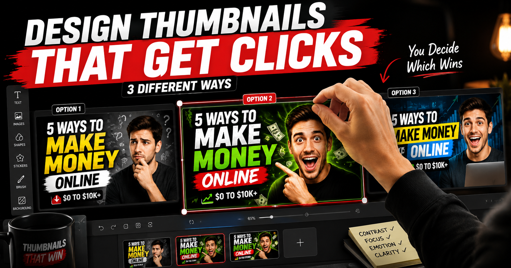
How Do You A/B Test YouTube Thumbnails for Higher CTR?
YouTube's native A/B testing tool lets you upload up to three thumbnails per video and shows you which gets the highest CTR after impressions hit a statistical threshold. Use it for every upload in your first three months — the data compounds fast.
Design two genuinely different thumbnails per upload, not minor color variations. One face-forward, one object-forward. One bright, one dark. Different focal points entirely. YouTube tests both, picks the winner, and serves it to the wider audience. Beyond YouTube's native test, open YouSEO Channel Analytics to compare CTR before and after thumbnail redesigns across multiple uploads. Pair the test with YouSEO Best Time to Post so your A/B tests reach the densest audience window — a great thumbnail still needs viewers online to click it.
How Should Beginners and Experienced Creators Approach Thumbnails Differently?
For beginners making their first thumbnails
Don't worry about polish or branding yet. Focus on three things: high color contrast, one focal point, and readable mobile text. Use free tools like Canva or YouTube's built-in template. Make ten thumbnails as quickly as you can — your tenth will be dramatically better than your first. The goal in the beginning isn't a perfect thumbnail; it's discovering which design choices actually move CTR on your specific channel.
For experienced creators testing and optimizing
You already know the basics. The leverage at your stage is systematic A/B testing on every upload, plus tracking patterns across 20+ thumbnails to identify what your specific audience responds to. Build a swipe file of your top-CTR thumbnails and look for the visual pattern. Most established creators discover that one specific element — a color, a framing, a recurring object — drives 60-70% of their CTR variation. Find yours.
Frequently Asked Questions About YouTube Thumbnails
What size should a YouTube thumbnail be in 2026?
YouTube thumbnails should be 1280×720 pixels (16:9 aspect ratio) and under 2 MB in size. JPG, PNG, GIF, or BMP formats are supported. Design at this exact size to ensure the thumbnail looks crisp across desktop, mobile, and TV displays.
How many words should appear on a YouTube thumbnail?
Three to four words maximum. Thumbnail text needs to be readable in one second at mobile size, and anything longer becomes a wall of text the eye skips. The text should add a curiosity hook the title doesn't deliver — not summarize the video.
Do faces really help YouTube thumbnails get clicks?
Yes, in most niches. Human faces with strong emotional expression outperform face-free thumbnails by 30-50% in lifestyle, education, vlogs, and gaming. The exception is product or tech reviews where the product is the focal point. Force-fitting a face hurts more than helping.
What's a good CTR for a YouTube video in 2026?
The niche median sits between 4 and 5%. Channels that consistently beat 6% get exponentially wider distribution from the algorithm. CTR below 3% on your last 10 videos signals a thumbnail or title problem the algorithm reads as content failure — fix it before the next upload.
Should I use clickbait thumbnails to get more clicks?
No. Clickbait thumbnails that don't match what the video delivers tank retention within the first 30 seconds. The algorithm reads the retention drop as viewer dissatisfaction and disqualifies the video from wider distribution. Curiosity gap is fine; misleading is fatal.
How Do You Put Your New Thumbnail Skills Into Action This Week?
You don't need design experience or expensive software to make thumbnails that get clicks. You need the right principles applied consistently. Pick the three principles most relevant to your channel and apply them on your next three uploads. Track the CTR shift inside YouTube Studio.
For the broader measurement loop, run your channel through Channel Analytics to compare CTR before and after redesigns across your full upload history. Once your thumbnails are converting, use Best Time to Post to make sure they're served to your audience at peak engagement. Try YouSEO free today.